dirtynine's Digest - The Thread for Kits

Zososoxfan

Member
SoSH Member
Jul 30, 2009
9,544
South of North
I didn't want to jinx anything in the WCQ thread, so I decided to go new thread here. New kits are popping up for the new club season and with the WC around the corner, we shouldn't short shrift the sartorial side of soccer. I was taking a gander at jerseys today, and I fell down the rabbit hole that is the US kit over history. What I noticed is that despite my recollection, there have actually been a ton of sweet iterations of the jersey. However, there have also been a lot of bland designs and all-whiteness that are terrible. There's also a slew of hilarious 80s/90s in there. What I'm getting at is, I think the US should settle on a template for some time and tinker. The US does not have a recognizable foundation, and I'd be happy with any number of designs to serve as a base.

My top 5:

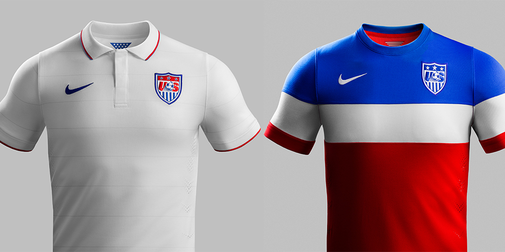
1) 2011 Third:

upload_2017-6-15_21-59-33.png

I'm a River Plate fan so I'm definitely biased. but, the sash is such an awesome design. The pantones are spot on too, and Nike stayed uncluttered for the rest. Numbers on the front is dumb (a recurring theme for some reason - silly FIFA rule(?)).

The white on blue sash kit was also dapper:

upload_2017-6-15_22-7-29.png


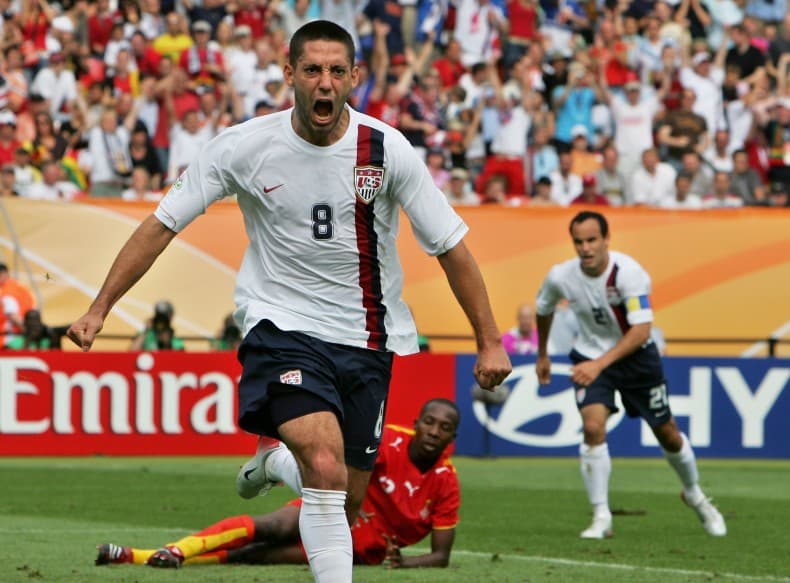
2) 2006 Away:

upload_2017-6-15_22-10-46.png

I could do without the number in the middle on the front (?), but this is a really nice, clean look. Love the thick red stripe at the top of the sox.

3) 2012 Home:

upload_2017-6-15_22-4-19.png

I'm a sucker for hoops. I think this shirt looks amazing and it certainly evokes the flag more closely than any other. Sticks out in a way that says 'Murrica, but in the good way!

4) 1998 Away:

upload_2017-6-15_22-14-47.png

This could easily be higher. I like red jerseys a lot, but if the collar weren't in the way, having the parallel horizontal line on the shirt and shorts is a nice touch.

5) 1996 Third:

upload_2017-6-15_22-17-39.png

You'll have to forgive the image (there's some weird voodoo with pictures of numbers 4 and 5 on this list), but I feel like I have to include a white one for posterity. The subtle horizontal lines look great, and if we're going to wear white jerseys, blue shorts are the only way to go to balance it out.

6): 1995 Third:

upload_2017-6-15_22-21-46.png

Bonus! I mean that clear blue is just beautiful, although I wouldn't start a template with it.
 

Attachments

Zososoxfan

Member
SoSH Member
Jul 30, 2009
9,544
South of North
Better pic of 1996 Third:

upload_2017-6-15_22-40-27.png

Also wanted to put the most iconic and worst jersey out here, because frankly, this jersey refuses to be forgotten. 1994 Away:

upload_2017-6-15_22-42-19.png

You knew it was coming. I laugh at the thought of these things FLYING off shelves in '94. I also didn't remember but the '94 home jerseys had wavy vertical stripes! I'm having trouble with pictures at the moment, but seriously, did Adidas just spite the US for having the WC after such a long diaspora away from the sport?
 

Attachments

Tangled Up In Red

Well-Known Member
Lifetime Member
SoSH Member
Nov 8, 2004
4,583
Potrero
The entire sash series was great, and could have been our permanent (dare I say iconic) look. The super light grey sash on the white jersey was an unsung hero of that kit era.


But yeah, #3, the 2012 home is the best kit ever worn by us.
 
Last edited:

Gunfighter 09

wants to be caribou ken
Moderator
SoSH Member
Jul 31, 2005
8,551
KPWT
I think the home kits need to be white, the simpler the better. The 2006 home whites were pretty great, I liked the vertical stripe:


That said, all other US national team kits bow before this one below. The Bomb Pop should be the eternal third kit. I have to think that if fucking Wondo had fucking scored they might come back.

 
Last edited:

Tangled Up In Red

Well-Known Member
Lifetime Member
SoSH Member
Nov 8, 2004
4,583
Potrero
Bomb pop?!?!?!? NOOOOOOOOOO!
That said, the same era's weird white golf/tennis style jerseys were at least passable.


swiftaw

Member
SoSH Member
Jan 31, 2009
3,533
I think if you take the vertical stripe from the 2006 home kit above and make it a sash then you might have a winner, kind of like the Crystal Palace kit from 1976


67YAZ

Member
SoSH Member
Dec 1, 2000
9,533
The sash series is our historic standard bearer. The 1950 kit, when we shocked the world and beat England:


OCST

Sunny von Bulow
SoSH Member
Jan 10, 2004
25,243
The 718
I am a total fanboy of the sash. Palace's sash, when they have had it, is awesome; I loved this one:


So yes, I would love it if they settled on the sash- it's a classic look but not used by many teams so it could become iconic for USA.

I like the hoops too.

The bomb pop is fun but the colors bug me - the red and blue should both be darker. Then it owuldn't be the bomb pop, I guess.
 

SocrManiac

Tommy Seebach’s mustache
SoSH Member
Apr 15, 2006
8,905
Somers, CT
Also wanted to put the most iconic and worst jersey out here, because frankly, this jersey refuses to be forgotten. 1994 Away:


You knew it was coming. I laugh at the thought of these things FLYING off shelves in '94. I also didn't remember but the '94 home jerseys had wavy vertical stripes! I'm having trouble with pictures at the moment, but seriously, did Adidas just spite the US for having the WC after such a long diaspora away from the sport?
Yeah, try buying one now. Last time I looked on eBay it was $400+.
 

Gunfighter 09

wants to be caribou ken
Moderator
SoSH Member
Jul 31, 2005
8,551
KPWT
The centennial home whites are pretty great. My only nitpick with those is that I wish they had went with a brighter red for the stripes on the shield. Other than that, they are perfect.

But, seriously, let's just talk about the greatness of the bomb pop some more. Sublime!
 

dirtynine

Member
SoSH Member
Dec 17, 2002
8,784
Philly
Flattered beyond words by this thread title. Lots to share when I'm at a computer.

Quick hit on US soccer: Centennial & Waldo should be our home and away looks, with some crazy revolving options for third/one-off. Those two are by far our most beloved and distinctive looks.

A wildcard: I've always had irrational love for our 2007 Copa America kit. The reverse Yankees, blue with white pinstripes. No idea why but it woks for me.
 

Attachments

dirtynine

Member
SoSH Member
Dec 17, 2002
8,784
Philly
Breaking news here! Gold Cup jersey has leaked. Hoopy Barca.


So close to ideal (Waldo)... I had a feeling based on some comments Rob Stone and others had made that something like this was coming. Glad it's not the full Waldo, for reasons I'll articulate shortly.
 

OCST

Sunny von Bulow
SoSH Member
Jan 10, 2004
25,243
The 718
I like it.

Another issue with the Centennial: I know it's part of the US flag motif, but aren't you not supposed to feature stars in or near your crest until you win a WC?
 

Zososoxfan

Member
SoSH Member
Jul 30, 2009
9,544
South of North
Breaking news here! Gold Cup jersey has leaked. Hoopy Barca.


So close to ideal (Waldo)... I had a feeling based on some comments Rob Stone and others had made that something like this was coming. Glad it's not the full Waldo, for reasons I'll articulate shortly.
It's a nice jersey, but honestly I think it hews too closely to Barca's home kit from last year. Maybe the pantones are different, but otherwise I think it's another case of copying. Which is why I didn't like the plain white design - felt like we were trying to copy England NT.
 

Tangled Up In Red

Well-Known Member
Lifetime Member
SoSH Member
Nov 8, 2004
4,583
Potrero
I get that it's the "Gold" Cup, but damn, those would look crisper and cleaner (and more representative) with white lettering/numbering and accents. I like them, but could like them so much more.
 

dirtynine

Member
SoSH Member
Dec 17, 2002
8,784
Philly
I like it.

Another issue with the Centennial: I know it's part of the US flag motif, but aren't you not supposed to feature stars in or near your crest until you win a WC?
We used to have stars in the Federation crest, because our earliest crests were derivatives of the Great Seal of the United States, which is obviously still used in official governmental capacities.


In earlier, pre-branding days, we're talking early 1900s, US delegations would use the shield in a lot of international competitive contexts like the Olympics, early World Cups, etc. Sometimes the stars from the flag's canton were included on the chief of the shield when the shield was displayed without the rest of the context of the Seal (which includes the stars differently). This is also the origin of the NFL shield, by the by.

As time passed, a) most individual sports and federations became branded under their own logos and marks, and b) soccer fell off a cliff in the US. Meanwhile, the rest of the world started making soccer-oriented design traditions, including what stars above a crest represented (championships).

When US Soccer returned to any kind of prominence, in the buildup to the 94 World Cup, they launched a new brand like other sports federations (think US Skiing, US Hockey, USA Basketball etc). It was very "soccer is awesome in a major way!", a relic of where both the sport and prevailing design language was in the 1990s when that era started. Here's the evolution:


Of course, as we slowly started to wake up and be a part of the global game, traditions the rest of the world had internalized started to dawn on us. Eventually, we enclosed our logo in a shield. One step forward. But, we then included stars and stripes to pad it out. Two steps back, as the stars were inappropriate, and the stripes were, for some reason, blue. So, finally, the new Nike-designed crest corrected this stuff. No stars, red stripes. In my opinion, it looks about as soulful as a logo for a Nike athlete's shoe line, but it's better.


And now the USWNT gets to put the three stars back! (On the outside, of course.)

All of this is a long way of saying, we were uniquely in a position to use the stars in our crest, and if we had returned to something like the centennial badge, we could have done so with unique plausibility among nations. But I'm glad that didn't happen, middling result aside. I want to add that USMNT star in my lifetime and have it be a big deal.

Before the newest logo hit, I wrote a lot about this by way of designing an alternative US crest if you're interested to read more.
 
Last edited:

JayMags71

Member
SoSH Member
Breaking news here! Gold Cup jersey has leaked. Hoopy Barca.


So close to ideal (Waldo)... I had a feeling based on some comments Rob Stone and others had made that something like this was coming. Glad it's not the full Waldo, for reasons I'll articulate shortly.
So, do we think these are real?


The stars seem out of place, making the shirt over-designed and "busy", for lack of a better word.
 

Titans Bastard

has sunil gulati in his sights
Lifetime Member
SoSH Member
Dec 15, 2002
14,636
Quick hit on US soccer: Centennial & Waldo should be our home and away looks, with some crazy revolving options for third/one-off. Those two are by far our most beloved and distinctive looks.
I'd sign up for this. I miss the Waldo, which was my favorite US shirt of all time.

Least favorite: our current 2nd shirt, black with the red and blue shoulders. It's heinous.


There's a pretty solid archive here:

http://www.socceroverthere.com/?page_id=14607
 

Zososoxfan

Member
SoSH Member
Jul 30, 2009
9,544
South of North
Really not digging that design. Stars along shoulders look pretty bad. Blue and red hoops are OK, but then overly complex with intricate designs. The blue looks like the wrong hue - USA kits should be navy. The two different shades of blue (hoops and sleeves) looks bad.
 

67YAZ

Member
SoSH Member
Dec 1, 2000
9,533
I remembered this classic - the wavy vertical stripes. I can't find it, but there is an earlier, simpler version of it that they used before the cup that is stellar - simple flat collar and and no cuff on the sleeves. I'd be totally into a vertical stripe 3rd kit.


And when combing through the 1994 jersey images, I stumbled upon this abomination...


Cellar-Door

Member
SoSH Member
Aug 1, 2006
36,716
I assume the Gold cup kit will be garbage, as have almost all the USMNT kits for the last 10 years. Because Nike makes garbage kits, without fail.
 

67YAZ

Member
SoSH Member
Dec 1, 2000
9,533
Why not a vertical striped primary kit?
I think Argentina owns that look for a primary shirt on the international stage. It's a beautiful, iconic kit, one that's even hard to screw up. Though this Reebok design tried hard:


Edit: Thinking about this one more, why would any federation allow the corporate logo to go above the crest?
 
Last edited:

Tangled Up In Red

Well-Known Member
Lifetime Member
SoSH Member
Nov 8, 2004
4,583
Potrero
Sky blue and white stripes in to black or navy shorts is excellent:


Nowhere near as sharp/special with white shorts:
 

Tangled Up In Red

Well-Known Member
Lifetime Member
SoSH Member
Nov 8, 2004
4,583
Potrero
Really not digging that design. Stars along shoulders look pretty bad. Blue and red hoops are OK, but then overly complex with intricate designs. The blue looks like the wrong hue - USA kits should be navy. The two different shades of blue (hoops and sleeves) looks bad.
Good notes on this. I agree. Ditch the (massive) shoulder stars on the digital mock and we have a winner!
 

Zososoxfan

Member
SoSH Member
Jul 30, 2009
9,544
South of North
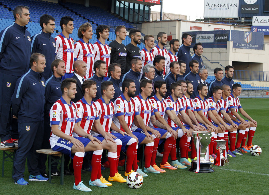
I think Argentina owns the Albiceleste vertical stripes for international play, but there's no reason why the US couldn't make rojiblanco theirs. I've thought about it a bunch, and I wouldn't mind using Atleti as a source for inspiration with their red white and blue and traditional kit style (shout out to Bosox!). I'm partial to the blue trim on the end of the sleeves and the collar. Gotta go blue shorts and the socks look good in red, white, or blue. My favorites are 04-05, 14-15, and 15-16:

2004-05:


Nike logo placement is odd, but secondary to the clean look. Flat collar is modern, blue trim is appropriate, and lines are not fussy.


2014-15:


Probably could use more red under the arm (what is this part of the jersey called?), but otherwise a very nice look. thicker blue trim definitely pops, probably a bit too much even. Don't love the vertical stripe on the shorts.

2015-2016:


I'd add blue trim to the end of the sleeve, but otherwise this jersey is clean AF and just rocks.
 

Zososoxfan

Member
SoSH Member
Jul 30, 2009
9,544
South of North
Sky blue and white stripes in to black or navy shorts is excellent:

Nowhere near as sharp/special with white shorts:

[pics snipped]
The albiceleste on navy shorts is a huge pet peeve of mine. I actually don't mind the white shorts as it was a change in pace, but yeah the traditional black shorts look badass. When they wore black socks with the kit in France '98, it looked pretty good too:


The black collar is a nice touch. What a team too. Ayala, Almeyda, Sensini, Lopez, Simeone, Batigol, Ortega, Veron, Astrada, Crespo, Gallardo, Zanetti, wowza! Too bad they ran into an equally badass dutch team in that QF: Van der Saar, Staam, Reiziger, de Boer 2x, Bergkamp, Kluivert, Seedorf, Cocu, Zenden, Overmars, Davids, Gio, Jimmy Floyd Hasselbaink! Bergkamp's goal is honestly one of the best goals of all time and I was absolutely devastated by it. Bottom 5 worst sports moments of my life. Crazier even is that these two teams probably didn't hold a candle to France or Brazil that year.
 

Tangled Up In Red

Well-Known Member
Lifetime Member
SoSH Member
Nov 8, 2004
4,583
Potrero
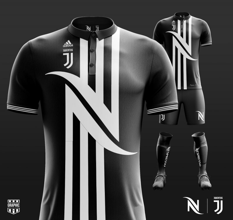
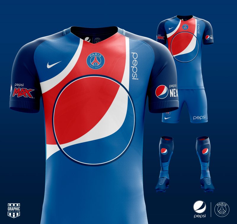
Kinda cool, kinda gross experiment with kits designed entirely around the sponsor. Although I think some of the aesthetics themselves are actually pretty good (Juvespresso; Pep-SG):
Definitely cool/gross. But really well done. Add Real/Apple to the win list.
 

Schnerres

Member
SoSH Member
Apr 28, 2009
1,559
Germany
@jkempa:
Not that I like Union, but they have a great 3rd kit:

The only negative thing is the white background in the club logo. They should have done that better (yellow background, red letters on the red shirt, possibly), but maybe it´s not allowed to change that.
 

candylandriots

unkempt
Lifetime Member
SoSH Member
Mar 30, 2004
12,776
Berlin
@jkempa:
Not that I like Union, but they have a great 3rd kit:

The only negative thing is the white background in the club logo. They should have done that better (yellow background, red letters on the red shirt, possibly), but maybe it´s not allowed to change that.
Ooh - that is cool! I might need to make a stop at the Zeughaus next month. Just got my tickets for the game with Kaiserslautern today :)
 

Zomp

Moderator
Moderator
SoSH Member
Aug 28, 2006
13,994
The Slums of Shaolin
I agree with you about United's away kit. My favorite since 07/08's all black away kit with the red chevron down the back.

Were you aware that United's third kit was actually voted on by fans? It doesn't make a difference, but I was surprised to not see the tidbit included in your write up.
 

Tangled Up In Red

Well-Known Member
Lifetime Member
SoSH Member
Nov 8, 2004
4,583
Potrero
Good stuff @dirtynine
Don't agree with everything (I do with the winner, natch). So much classy logo manipulation this season. Don't recall that much from year's past...
 

dirtynine

Member
SoSH Member
Dec 17, 2002
8,784
Philly
Were you aware that United's third kit was actually voted on by fans? It doesn't make a difference, but I was surprised to not see the tidbit included in your write up.
It sounds familiar now that you mention it, but no, I was not writing with that front of mind. Should have done a bit more research there. In some ways it explains a lot - it looks like something fans would rally behind. We'll be seeing it for years, I imagine. I didn't mean to be too harsh, but something about the implementation just didn't click for me.