Celtics have a "new" logo

Leather

given himself a skunk spot
SoSH Member
Jul 18, 2005
28,451
My guess is that it's for use in contexts where a smaller logo is appropriate, because the main logo is too detailed to discern when it gets too small.   So you'll see this on sleeves, shorts, press releases, etc...
 

Devizier

Member
SoSH Member
Jul 3, 2000
19,680
Somewhere
The Celtics still employ a short guy who does stunt dunks while dressed as a leprechaun, right? I don't think they're thinking about correctness here, political or otherwise.
 

zenter

indian sweet
SoSH Member
Oct 11, 2005
5,641
Astoria, NY
drleather2001 said:
My guess is that it's for use in contexts where a smaller logo is appropriate, because the main logo is too detailed to discern when it gets too small.   So you'll see this on sleeves, shorts, press releases, etc...
 
Yeah. And, in line with the general evolution of design, the sporting world is going from full-color and literal to 2-3 color and representational. You might hear the word "clean" to describe it. I honestly don't like the full-color leprechaun anyway, and think this silhouette is a step in the right direction. But maybe I'm in the minority.
 

JimBoSox9

will you be my friend?
SoSH Member
Nov 1, 2005
16,677
Mid-surburbia
zenter said:
 
Yeah. And, in line with the general evolution of design, the sporting world is going from full-color and literal to 2-3 color and representational. You might hear the word "clean" to describe it. I honestly don't like the full-color leprechaun anyway, and think this silhouette is a step in the right direction. But maybe I'm in the minority.
I like it better too, but they need some way to preserve the clover shape in it.
 

wutang112878

Member
SoSH Member
Nov 5, 2007
6,066
Our uniforms / logo / color scheme have stood the test of time and are still one of the best in the league, there is no reason to do anything to them and there isnt possibly enough additional revenue to be had with this to justify it.  This is like 'tweaking' the CocaCola recipe, oh wait they tried that and it failed miserably after 79 days.  And yes I am way overly protective of all things Celtics
 

SemperFidelisSox

Member
SoSH Member
May 25, 2008
31,613
Boston, MA
Forget the secondary logo, they need to remove the colors from the primary one and go back to just green and white. It makes the court look so much better too.


stp

Member
SoSH Member
Jul 19, 2005
398
Cape Ann
The logos posted here are so  much better than what they chose.  It looks like it was cut out with a cookie cutter.
 

vadertime

Member
SoSH Member
Jul 31, 2006
1,602
Rhode Island
I was expecting some PC bull with the pipe removed because they "don't want to encourage kids to smoke".  So I was pleasantly surprised to find out it wasn't the case.
 

John Marzano Olympic Hero

has fancy plans, and pants to match
Dope
SoSH Member
Apr 12, 2001
24,715
The Allented Mr Ripley said:
I never knew until today that Red Auerbach's brother created the Celtics logo.
 
 
He also created this one for the Senators


I think this logo is really bad ass.
 

Beomoose

is insoxicated
SoSH Member
May 28, 2006
21,512
Exiled
John Marzano Olympic Hero said:
 
 
He also created this one for the Senators


I think this logo is really bad ass.
I like the direction he was going but from the cigar up that character's head is a mess.
 

Sprowl

mikey lowell of the sandbox
Dope
SoSH Member
Jun 27, 2006
34,771
Haiku
ifmanis5 said:
They're calling it a "secondary" logo. Is this an attempt to make is slightly more politically correct/less ethnic-y?
 
http://www.underconsideration.com/brandnew/archives/celtics_secondary_logo.php#.U7GF_fldVyw
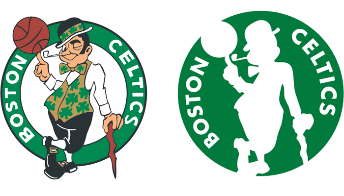
 
Doesn't the new one make the leprechaun look whiter than ever? Melanoma'll be the death of this franchise.
 
The Allented Mr Ripley said:
Yeah, I think these are fine as secondary logos that keep things simple:

 
This one's my personal fave. Botanical emblems rule!